Problem → Solution → Result
Problem: Nobitex sponsored Sahneh, a music competition show streaming weekly on Filimo, and the campaign landing page had two weeks to exist. It also had to feel like a game rather than a form, because the whole premise was that a viewer heard a secret code on television and came to claim something. The playful parts were going to be built in Rive by our visual designer, until one of them, a static background, cost a frontend developer about four hours to implement. There were four more interactions behind it and no room in the schedule for four more of those.
Solution: I am the Product Design Lead at Nobitex, but on this campaign I worked as an IC alongside the PM. After the developer and I agreed in our day-to-day conversations that Rive was not going to be developer-friendly here, I took the four remaining micro-interactions off the team's plate and built them myself with Claude Code, on a parallel track, and handed them over as typed, documented, responsive code.
Result: The frontend team integrated all four on 12 August. QA tested them, performance included. The campaign goes live on 19 August and runs for fifteen weeks.
What Sahneh is
Sahneh is a music competition reality show on Filimo, Iran's largest video-on-demand platform, running weekly for fifteen weeks. Nobitex, the country's largest cryptocurrency exchange and where I lead product design, is one of its sponsors.

The mechanic is simple, which is exactly why it had to feel good. In each episode the host talks about crypto for a minute and then reads out a four-digit code, along the lines of "there's a prize wallet waiting for you at Nobitex, and here's tonight's code." A viewer opens the landing page, signs up or logs in, enters the code, and a prize card opens.
The campaign's flow, its business goals, and its results belong to a separate case study that I'll publish once the show has aired and the numbers are real. This one is about something narrower: four micro-interactions, why I ended up building them myself, and what it looks like when a design lead puts code on the critical path.
A simple background cost four hours
We had two weeks, and not two weeks of design. Two weeks of everything. The backend team was building the prize allocation logic, which was the genuinely hard part: codes, eligibility, wallet crediting, fraud. We're a cross-functional team with several frontend developers, and the strongest of them was building the entire landing page from my designs. I was doing the design work, the reviews, the stakeholder loops, and the fifty small decisions a day that a campaign like this generates.
The landing page also needed to be playful, and that was not a nice-to-have. You watched a show, you got a secret code, now go claim something. That's a game, and a game that feels like a form submission is a dead campaign. So the page needed a CTA that felt alive, a code-entry button that felt like pulling a lever, a loader that wasn't a spinner, and a prize card that felt worth opening.
The obvious answer was our visual designer, who is fast and good, and who was already producing this kind of motion in Rive. Rive is a real gift to a visual designer on a short clock. You can build state-driven motion in an afternoon without writing anything, and it does things that would take a developer a long time to hand-code.
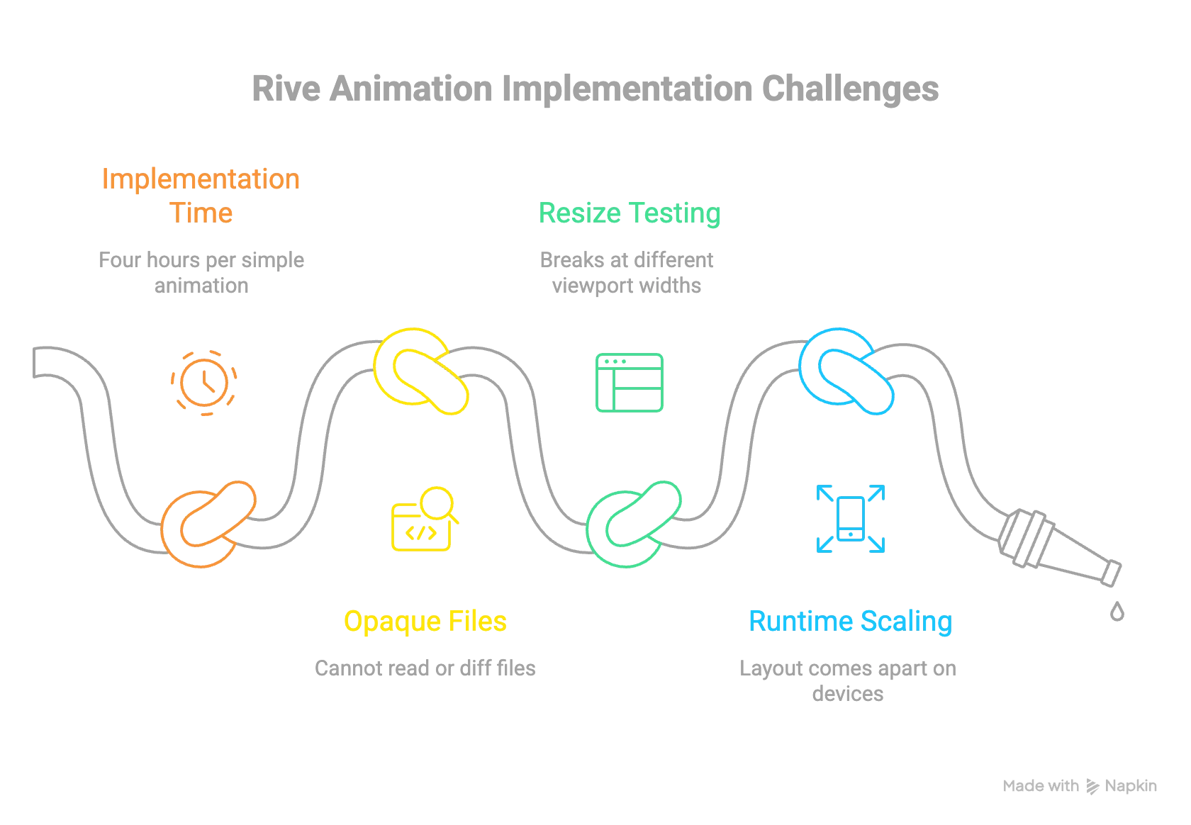
Then we shipped the first one. It was the campaign background, and it is about as simple as a Rive file gets, and it took the developer roughly four hours to implement.
Nobody did anything wrong. That's just what the handoff costs, and once you've seen the number you can do the arithmetic on the four interactions queued behind it, all of them more complicated than a background. A .riv file is opaque to the person who has to ship it. You can't read it in a pull request, you can't diff it, and you can't resize-test what's inside it, so when something breaks at 390 pixels wide the fix goes back to the designer, into Rive, back out as a new binary, back into the branch. Every iteration is a full round trip between two people.
We had also tried the main CTA in Rive, and at certain viewport widths its internal layout came apart. The runtime was scaling a composition authored at fixed proportions and there was no way to reach inside and teach it to behave. It looked fine in the file, it looked fine in review, and it broke on real devices, which is the only place that counts.
Why I took the work instead of handing it back
There were four options and we talked about all of them in the course of ordinary daily conversation, not in a process.
The visual designer could build the remaining four in Rive. That was the plan of record, and after the background we could price it: four more binaries, each one costing the developer implementation time we didn't have, each one unfixable by the person holding it. The frontend team could hand-code them instead, except they were building the whole landing page and had no capacity for four bespoke interactions on top of it. We could cut the playfulness, which would have saved everyone time and quietly killed the reason the campaign existed. Or I could build them.
I took the fourth. In a meeting I said I'd do it myself, and I built them with Claude Code on a parallel track over the following two weeks.
The part I'd defend hardest isn't the decision, it's the condition attached to it. This only works if the developer who has to integrate the result is in it from the first question. Otherwise you haven't removed a handoff problem, you've invented a third one and put your own name on it. So I worked in constant contact with him, delivered every day, and shaped every component around what he'd have to do to consume it. A design lead who ships code that a frontend team can't absorb has made things worse while looking productive.
How I actually worked
I didn't write one prompt and hope. What worked was a loop I ran four times, once per component, and it looks much more like product management than like coding.
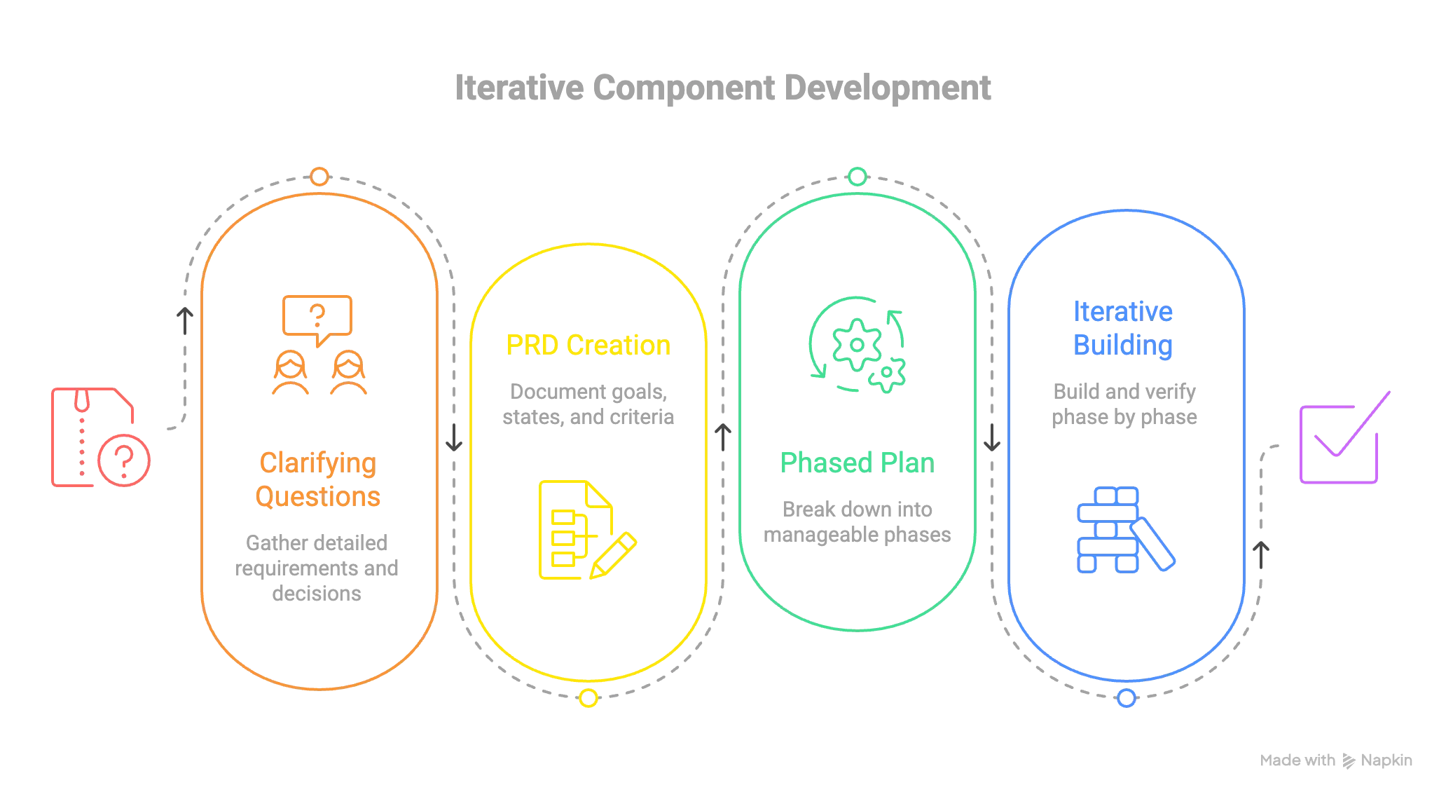
Explain the concept, then ask for at least ten questions back. This is the step that does the most work and the one most people skip. Before any code I'd describe what the element was and what it was for, then explicitly ask for at least ten clarifying questions before anything got written. The questions that come back are the value. They're the questions a good engineer asks in a kickoff and they surface every decision I hadn't made yet. What happens when the user presses this twice? Is loading a state you own or one the parent tells you about? What's the minimum width this has to survive? Does the disabled state still animate? Answering ten of those up front is roughly ten rounds of "actually, can you change" that never happen later.
Turn the answers into a PRD. Goals, and more importantly non-goals. What the component is, what it explicitly isn't, the states, the props, the acceptance criteria, the accessibility floor, the browser floor. Versioned with a changelog, so when a decision changes I can see what it used to be and why.
Turn the PRD into a phased plan. This is the piece I'd recommend to any designer working this way. Not a task list, a phased plan, where every phase has its own acceptance criteria and nothing starts until the previous phase's criteria actually pass. Phasing stops the model from producing an impressive-looking whole that is subtly wrong everywhere at once. You get something small and verifiably correct and you build on it, and when something does go wrong the blast radius is one phase. The plans also carried one rule that saved me real time: if a motion bug survives two fix attempts, switch models instead of iterating. Rendering bugs are exactly the class of problem where trying the same thing harder does not converge.
Build phase by phase, and verify by measurement. The rule I care most about is that a screenshot is never proof. "The contrast looks fine" is not a result. Sampling the composited pixels and getting 3.03:1 is a result, and that number is real, it's what the first pass of one of these buttons measured, and it failed AA. So did a focus ring at 1.55:1. Both were caught because the acceptance criterion said measured, not looks right.
What a phase actually looks like
An unedited excerpt from the loader's plan. Phase 0 wrote no code at all — its whole job was to measure the source artwork and record what was true, so nothing downstream got built on a guess.
Phase 0 — Source analysis · ★☆☆ · COMPLETE

  [x] 0.1  Read the source SVG; identify the two paths and their roles.
  [x] 0.2  Split Path 1 into three sub-paths; identify left / right / top face.
  [x] 0.3  Measure each sub-path's arc length (flatten cubics numerically).
  [x] 0.4  Check for shared/double-stroked edges between faces.

Acceptance: MET. Geometry recorded in PRD §3.

Phase 0 findings

  F1  The mark is 3-fold rotationally symmetric. All three faces measure
      861.17 units (< 0.01u spread), segment-for-segment congruent. The single
      most important fact in the project: one dasharray, one keyframe, two
      delays. No JS measurement, no per-face constants.
  F2  Faces are disjoint closed loops. No double-stroked seam to reconcile.
  F3  "Parallel" is already in the artwork — no offset rail needs constructing.
  F4  Centre triangle is a fill, not a stroke. It stays static.
Finding F1 is the whole component. Because all three faces are the same length, the relay is one dash pattern and two delays instead of runtime measurement and per-face constants. That is what collapsed the file to under 8 KB with no JavaScript.
Phase 1 — independent confirmation, in the browser

  Face    Browser      Python (Phase 0)
  top     861.1643     861.16
  left    861.1658     861.17
  right   861.1670     861.17

  Spread 0.0027u · delta vs Python 0.003u

F1 confirmed by the rendering engine — the engine that will actually interpret
stroke-dasharray. The dash geometry is validated; Phase 2 can use it without
re-measuring.
The measurement was then re-taken in the browser rather than trusted from the offline pass — the acceptance criterion said measured, not looks right.
None of that is a coding skill. It's specification, scope control, and verification, which is the job I already had. What changed is that specifying precisely now produces the thing instead of producing a ticket.
The four components
The button that couldn't touch the design system
The main CTA, the thing a viewer taps to enter their code. It had to look expensive: a solid readable centre framed by animated circuit-board traces, a glow that follows the cursor, and a small lock that swings open as you approach.
The hard part was that it could not be a new button. Nobitex has a design system and the landing had to use its Button, with the same tokens, sizes, disabled and loading behaviour, and accessibility. So this isn't a button, it's a wrapper that paints decoration around and behind a component it is forbidden to modify. The base Button's token classes use !important in places, so the first phase was a spike whose only job was to find out whether the decoration could win the cascade at all, and how. The answer was to stop fighting the fill, neutralise it, paint my own layers, and make every decorative layer pointer-events: none so clicks still land.
What the process caught is my favourite thing that went wrong on this project. Phase 0 recorded a finding that the disabled state needed no special handling. Weeks later the developer told me disabled wasn't working, and he was right. The finding had been verified against a stand-in for the design-system button, and the stand-in marked its disabled background !important where the real one doesn't, so my transparent fill was beating the real disabled colour and a disabled button rendered as an invisible rectangle. The fix was one line. What mattered was that there was a written finding to go back to, mark as wrong, and correct, with the measurement that proved it: rgba(0,0,0,0) before, rgb(138,138,138) after. A wrong assumption written down is a bug you can find. A wrong assumption in someone's head is a bug that finds you.
In the demo below, switch the state, toggle the lock, then drag the right edge of the stage. That resize handle is the whole reason this component exists.
Cost: about two working days across six phases, plus that bug fix two weeks later. Zero changes to the design system's Button, verified byte-identical at 29,692 bytes.
The lever
The button that submits the four-digit code, and the moment of commitment in the whole campaign, so it had to feel like a physical object: brushed steel, raised at rest, breathing slightly, retracting under your finger, throwing off a shockwave when it fires.
The hard part is that "feels physical" is a pile of small correctness problems wearing a trench coat. The press has to release when you drag off the button, and on pointercancel. Space and Enter have to behave exactly like a tap. A press already in flight must not survive the button going busy. The idle float and the hover lift have to compose rather than overwrite each other, which is why one rides on transform and the other on translate. None of that is visible in a mockup. All of it is visible the first time a real thumb slides.
What the process caught was a defect headed straight for the campaign's most important browser. The loading state draws a dashed ring that marches around the button, and it used SVG's pathLength attribute to normalise the dash units. WebKit doesn't implement pathLength on basic shapes, so on Safari and iOS Safari, where a large share of a television audience actually is, the ring would have rendered as a near-solid hairline. A cross-browser audit caught it because the plan had a phase for exactly that, and the fix, absolute pixel units, turned out better anyway.
Cost: nine phases in one hour and sixteen minutes, 11:37 to 12:53 on a Monday. Ships at 2,664 bytes gzipped with zero runtime dependencies and no image assets.
One file, no dependencies
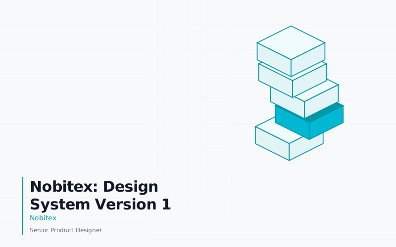
The loading state, and not a spinner. The Sahneh brand mark itself, an isometric box, with a lit segment travelling its own outline and handing off from face to face like a relay.
The hard part was a constraint I set rather than one I was given: it had to be a single standalone SVG. No React wrapper, no Lottie, no build step, no dependency. Drop it in as an <img>, a CSS background, or an inline paste, and it behaves identically in all three. That's a handoff decision, not a technical one, and it makes the deliverable almost impossible to integrate wrongly.
What the process caught was a shortcut hiding in the artwork. Phase 0 was nothing but measurement, and it found that the mark is three-fold rotationally symmetric: all three faces measure 861.17 units, within a hundredth of a unit, congruent segment for segment. That one fact collapsed the whole problem into one dash pattern, one keyframe, and two delays, with no JavaScript measuring paths at runtime and no per-face constants to drift. I wouldn't have found it by looking. I found it because the plan's first phase was to measure the source and write down what's true before anything got built on a guess.
Cost: one afternoon, 13:48 to 18:03 on 28 July. Seven phases, one file under 8 KB, zero dependencies.
The one that was supposed to take four days
The payoff. A closed card that jiggles to invite a tap and opens into one of four prize types: the grand prize, a cash prize, a trading-fee discount, or a partner brand's gift code.
This one isn't an animation, it's a real component, and that's what made it hard. Four typed variants where the type system makes the wrong combination impossible, so a coupon can't carry an amount and a cash prize can't carry a partner brand. A fully controlled card, so an external claim button and a tap on the card itself drive one piece of state with no sync bugs. Text that fits at every width in a language with long words. Fifteen tracked defects, each with a root cause written down rather than just a fix.
The defect the process caught here was in the handoff rather than the component. While I was writing the integration guide, an audit of the bundle found an import.meta.env.DEV, a Vite-only expression, sitting in a module the landing page would import. Under the landing's build it would have thrown at module load. Not a subtle visual bug, a white screen, on the developer's first attempt to use it.
The comparison, honestly: the estimate for this card was about three days in Rive plus roughly a day of developer implementation. The first build session produced the card, its closed state, the assets, the typography, and all four prize types. A second added what the estimate never covered, the opening reveal, a typed public API, layout-shift hardening, and those fifteen fixes. A third produced the handoff bundle. So the honest headline isn't that it was three times faster. It's that the same clock bought a different kind of thing: a typed React component with documentation a developer could act on alone, instead of a binary that still needed someone else's day to become real.
Cost: two build sessions plus a handoff session. Eight phases, fifteen tracked defects, four prize variants.
What shipped
All four components went into the landing page and the frontend team integrated them on 12 August. QA ran them through the full pass, with particular attention to performance. The campaign goes live on 19 August and runs for fifteen weeks.
The outcome I actually care about is that the frontend team was never blocked. The micro-interactions were built on a parallel track and arrived as code the team could read, diff, review, and change without me. On a two-week campaign the thing that kills you isn't difficulty, it's serialisation, and this removed a serialised dependency from the critical path rather than adding one.
Responsiveness stopped being a risk, which is where this whole thing started. The main CTA holds together from 280 pixels to a desktop monitor because it's laid out by the same CSS as everything else on the page rather than by a runtime scaling a fixed composition. The resize handle in the demo above exists specifically so you can check that yourself.
Three integration-breaking defects were caught before the frontend team ever saw them, and a fourth was caught by the developer and root-caused back into the written findings so it couldn't recur silently. Contrast was sampled from composited pixels rather than eyeballed, and two of those measurements failed on the first pass and got fixed, which is the entire argument for measuring.
I have no campaign numbers and won't until the show has run. Activation and acquisition results belong to the separate case study.
What I'd do differently
I'd get a real device into the loop earlier. Touch emulation lied to me at least once: the main CTA's touch behaviour was verified through a simulated code path long before a thumb ever touched it. Emulation is a way to iterate quickly, not a way to be finished.
I'd close the browser matrix properly. For one component, Safari, iOS Safari, and Firefox were never actually run. Firefox wasn't installed and Safari couldn't be scripted, so the feature surface was audited against known support instead. That's a reasonable fallback and a bad substitute, and it's a little ironic given the best defect this project found was a WebKit one.
I'd also fix the contrast I chose not to fix. The main CTA's label sits at 4.13:1 in dark mode, better than the design system's own dark primary at around 3.74:1, but under strict AA. I accepted it because the brief was explicitly that fancy was the priority, and darkening the gradient is a one-line change I could still make.
The loader is the decision I'd actually argue about. It ignores prefers-reduced-motion and always animates. That was a stakeholder call, taken with the tradeoff said out loud and written into the spec as an accepted risk, and the integration guide documents the two-line snippet a consumer needs to suppress it. I still think it's the weakest decision on the project and it's the first thing I'd take to an accessibility review.