Problem → Solution → Result
Problem: Nobitex held gold-backed tokens like PAXG and XAUT, but it had never built a page for anyone searching to buy gold, and it had run no SEO activity on those terms at all. Every competitor had one, from crypto exchanges to platforms that sell nothing but digital gold. Part of the gap was language. Iran buys gold by the gram and searches for خرید طلای دیجیتال, while Nobitex offered ounce-denominated tokens listed under their ticker names, so to anyone who wasn't already crypto-native it looked like Nobitex simply didn't sell gold.
Solution: I'm the Product Design Lead at Nobitex, and on this project I was the only designer on User Growth, our cross-functional activation squad, working next to the PM and an SEO specialist embedded in the team. I benchmarked the market, took the page from wireframes to high fidelity, built its visual system through a JSON-prompt pipeline, and vibe-coded a live responsive prototype with Claude Code that engineering built from directly.
Result: The SEO team's quarterly key result asked for an average rank of 20 across two keywords. Both finished at rank 1 and the key result closed at 100%, from a baseline of no page and no ranking. The page has been live since July 2026.
Nobitex had the gold, not the page
The tokens had been there for a long time. PAXG and XAUT sat in the listing like any other asset, and a user who already understood that a gold-backed token is gold could buy one in a couple of taps.
Everybody else was the problem. In Iran gold is quoted, bought, and argued about in grams. The word people type into Google is طلا, not the ticker of an ounce-denominated token, and there was no page on the site using those words, so there was nothing for the search engine to return. Meanwhile at least three exchanges that also sell digital gold, and a set of dedicated gold platforms, all had pages built exactly for that query.
So this started as a team OKR rather than a design brief. The SEO team, who work full-time on the site's search performance and keep their own rank dashboards, wrote a key result for the quarter: get the average rank under 20 for خرید طلای دیجیتال and خرید آنلاین طلا. The baseline was not a bad number. There was no number. Nothing existed to measure.
What the competitors were doing
I went through two groups. The first was exchanges that had added gold next to crypto: BitPin, Wallex, Ramzinex among them. The second was platforms that do nothing else: Milli, Melli Gold, Invo.
The split mattered more than any individual page. The dedicated platforms sold gold as a familiar, safe, boring thing you already understand. The exchanges tended to sell it as another asset on a trading venue. Nobitex needed the first posture on a page that lived inside the second kind of product, which set up the question the rest of the design had to answer.
Cutting the box that asked twice
The question was whether this page should inform or persuade. A price-led page tells you what gold costs today and lets you decide. A motivation-led page assumes you already half-want gold and spends its space on why buying it here is a good idea.
We went with motivation, and the first thing that decision killed was something I had already drawn. The wireframe had a buy section near the top: a box with two inputs, the familiar amount-and-currency pair. It looked right. But the page doesn't complete a purchase. It sends you to Easy Trade, where you fill in the same two fields again. So the box collected input it couldn't use, and its reward for a user who typed into it was to make them type it again one screen later. I cut it and replaced it with a single large call to action.
I want to be careful about what I claim for that. It made the page shorter and removed a duplicated interaction. I have no measurement showing it moved anything, because the number that would prove it — how many people who land here go on to Easy Trade — is one I never instrumented. That omission is the thing I'd fix first.
The value propositions went the other way. They started as a row of small stacked cards with simple icons, which was tidy and forgettable. In review, stakeholders pushed for something with far more visual presence, and that became the fan carousel: a stack of cards fanned out like a hand, each carrying one large rendered object. It's the piece of this project that got the strongest reaction, and it came from being told my first version was too quiet.
The comparison nobody could read
The hardest section was a comparison between buying gold at Nobitex and the alternatives: physical gold, gold funds, other exchanges. Six features, four columns, and a mobile viewport.
I did not want to ship a table. Tables are the obvious answer and they look like a spreadsheet, so I explored two ways out and built both properly rather than sketching them.
The first was a mountain chart: one continuous animated line with four peaks, Nobitex always the tallest and brightest, the whole shape morphing every few seconds to represent the next feature, with tooltips riding above each peak. The second was an isometric version of the same idea, four 3D columns in a shallow perspective, shipped behind a separate route so both could be compared side by side. Both were fully vibe-coded, animated, responsive, and real enough to use.
Then I put them in front of people. A small internal pilot, five colleagues plus two people from the design team, and the result was consistent and unkind: nobody could work out what was being compared. The peaks were pretty and meaningless. Height encoded a value that didn't exist, so viewers had no way to convert what they were seeing back into a claim about gold.
The final Figma file I handed to engineering has a plain table in it.
I'd rather have this in the case study than the mountain chart. Two well-built concepts that tested badly and got dropped says more about how I work than one concept that happened to survive.
Five visuals that had to look like one set
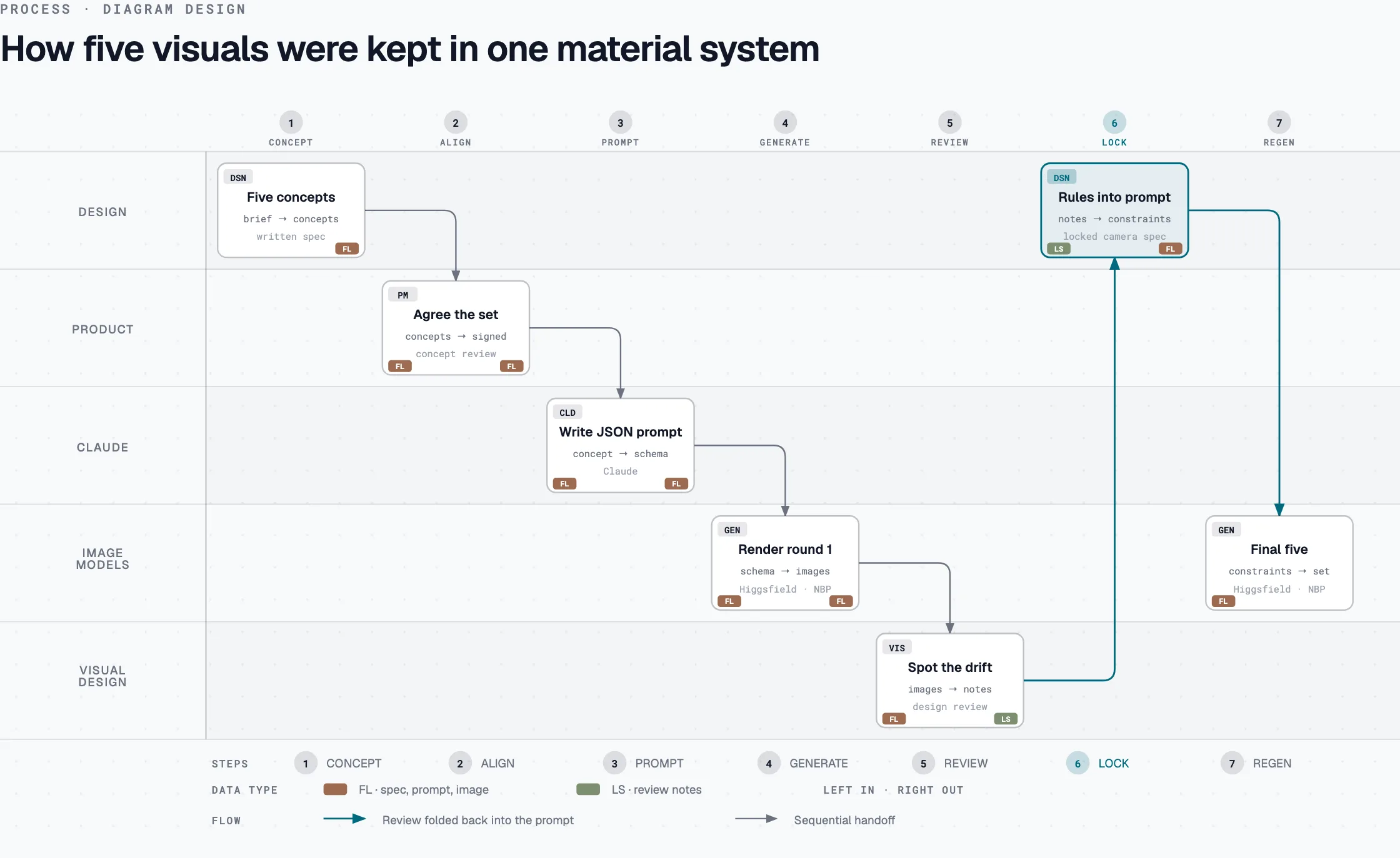
The fan carousel needed five hero objects: a percent symbol for the lowest fee, an infinity loop for 24-hour trading, a receipt for gold-backed loans, a 10x for margin, a reversing arrow for profiting on a fall. Five images that had to look like they were photographed in the same studio on the same afternoon.
So I built a pipeline rather than prompting five times. I worked the concepts out with the PM first, wrote them up, then used Claude to turn each concept into a structured JSON prompt, and generated the images through Higgsfield and Nano Banana Pro. The point of the JSON was consistency: the same material, lighting, background, and camera description in every prompt, expressed as fields rather than as prose I'd have to remember to repeat.
The visual design team reviewed the output, and their notes went back into the prompts rather than into a retouching pass. That loop is what produced the two rules below, and the whole set took about two to three working days.
The two rules that made five images look like one set
After the first round came back inconsistent, two constraints got written into every prompt as non-negotiable fields. The second one was the fix that mattered, because "elevated 3/4 angle" means something slightly different every time it's generated.
1. Matte/brushed gold only — soft, low-texture, gentle diffused
   highlights, matching the reference gold-bar photos. Never
   mirror-chrome, never high-gloss/hard specular hotspots.

2. Locked camera spec — every asset uses the identical numeric
   camera/object-orientation block:

     camera elevation      25°
     camera rotation       35° clockwise
     lens                  50mm-equivalent, near-orthographic
     object tilt           -15° backward
     object rotation       10° off-center

   Copy this block verbatim into every new prompt — no descriptive
   substitutes like "elevated 3/4 angle."
The brand purple was held to 5–10% of the visible surface in every image, as a thin inlay or glowing seam rather than a second colour mass, so the accent reads as the same material decision across all five.
Four teams already owned gold
The part of this project I'd actually defend in an interview isn't on the page. Nobitex already had gold content in three other places, all of it built by people who weren't going to be pleased that a new page had arrived to compete with theirs.
Marketing ran gold campaigns on their own landing pages, with their own slogans, spun up and retired on a campaign cycle. The Magazine had a digital gold price page, built with the SEO team, that ranked and drew traffic but had no call to action into the product at all. It told you the price and let you leave. And a new SEO page competing with both of them for the same query is not a win for the company, it's cannibalisation with extra steps.
The PM and I took this into two meetings with Marketing, SEO, and the Magazine, and we came out with three agreements.
- Links point inward, not outward. Marketing's campaign pages link to the SEO landing. The landing doesn't link back out to them, because a page built to rank shouldn't be spending its authority on temporary campaign URLs.
- The Magazine's price page stops being optimised. Effort and resources move to the new landing instead. That page keeps existing and keeps its traffic, but it's no longer the thing being pushed.
- Coordination continues. Ours is permanent, Marketing's are seasonal, so every new gold campaign needs a decision about how it relates to the landing rather than quietly competing with it.
The fourth team was a genuine collaboration rather than a negotiation. Easy Trade was rebuilding how gold buying is expressed in the product, moving it from ounce-denominated tokens to grams, which is the unit an Iranian buyer actually thinks in. We ended up trading components: the gram-based price chart I built for the landing went into their feature, and the ounce-to-gram conversion API they built is what my chart and the page's price figures run on. Neither of us built the other's half twice.
What happened
The key result closed at 100%. The target was an average rank of 20 across the two keywords; both ended the OKR window at rank 1. Over the window as a whole, خرید طلای دیجیتال averaged 4.3 and خرید آنلاین طلا averaged 29.2. The gap is because the second keyword took longer to stabilise, not because it finished worse. Search Console recorded roughly 64,500 organic clicks against about 102,000 impressions for the page in that period. The page went into the index in early July 2026 at around rank 28, and has been live since.
There's a second outcome I care about more, because it's the one that outlived the project. Handing engineering a working, responsive, vibe-coded prototype instead of a static file meant they didn't spend their week rebuilding layout decisions from screenshots. They spent it making the page dynamic, turning it into something that can be driven by a content dashboard, so the next asset in this shape doesn't need a new page at all. Silver, copper, oil: whatever gets added next inherits this.
And the fan carousel got singled out by the CPO and CEO in the OKR review, which I mention because it's the one moment from this project I actually remember.
What I'd do differently
I'd measure the click-through to Easy Trade. This is the real gap. I have the rank, the impressions, and the organic clicks, but not the one number that would tell me whether the page persuaded anyone: how many people who arrived went on to buy. Every design decision here — cutting the buy box, the fan carousel, the plain table — was made on judgment, and I can defend the judgment but I can't show the number. I'd instrument that on day one now, and I'd sit with behavioural session recordings to find where attention actually drops.
I'd push much harder on motivation and trust. The page argues that Nobitex is a good place to buy gold. It doesn't do enough to make a first-time buyer comfortable that buying gold online is a sane thing to do at all, and that's a different and harder job. More trust-building content, a better comparison against the alternatives, and something on global gold movements to give a hesitant buyer a reason to act today.
I'd test with real users, not colleagues. Seven internal people caught a serious problem and saved me from shipping a comparison nobody could parse, which is a good return for an afternoon. But they're not the audience, they know the product, and a finding that clean deserved confirmation from people who don't work here.